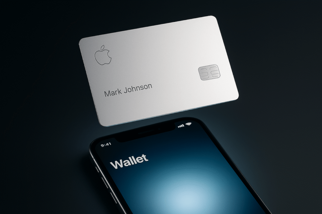
CNBC’s coverage of the Apple Card announcement makes one thing clear: Apple didn’t just build a credit card – they built a user experience with a credit line attached. The physical card is minimalist flex, sure, but the real move is inside the Wallet app. Clean categories. Real-time interest previews. A design that feels more like a dashboard than a bill.
It’s fascinating how quickly Apple can make an old industry feel outdated. Most banks still celebrate when they successfully redesign their login page. Apple launches a credit card and suddenly the entire financial sector looks like it’s been operating on dial-up.
The Apple Card doesn’t solve every problem – credit is still credit – but it does shift expectations. If Apple can make financial anxiety look almost elegant, what does that say about the rest of the industry?
Will people choose a credit card the same way they choose phones and headphones? And what happens when tech companies start redesigning every part of life that feels unnecessarily complicated?
Related article: CNBC